Overall I feel that my products show conventions of real media products as they show continuity throughout them. This is important as real products need to having linking features throughout them so that it is obvious to the audience that all products are one and represent the same thing. I also think that my products show conventions of real media products as it includes elements of what a media product should include therefore making it look realistic rather than fake.
Here are the conventions of existing products compared to my own products.
Here are the conventions of existing products compared to my own products.
In terms of my digipak I thought that sticking to the conventions that apply to my genre was the most important as I want it to appeal to my target audience in order for it to become successful. I also liked the simplicity of just having a picture of the artist as a background cover, however if I were to change it I would maybe do a pattern and not include a picture of the artist at all as that is what the digipaks I have analysed have.
When I started doing my disk cover, the first idea that came into my head was to do a plain black background like the 1975 did (and You Me At Six but with the white background) however when I did it I thought it looked boring, so for both discs I changed them a bit whilst still sticking to the conventions of a real digipak. I applied the pattern to one of my discs as there is the smashed mirror on top of the black background, and to the other one I put a photo over it.
Much of my digipak has blurred pictures of my artist on as I thought this would promote the feeling of the whole album itself, and would link to the other products by creating a distorted feeling.
In terms of my album advert poster, I think I stuck to conventions of my genre as well because the plain image with as little information as possible promotes the idea that rock is a genre that concentrates mainly on music, therefore artists only want to promote their music and themselves as artists, rather than what the media portray them to be, where as pop is all about people promoting themselves for success and not their music.
The first idea I tried out stuck to the conventions of an album advert, however I realised the design is just as important and how just because you have the main conventions, it doesn't mean that your overall product will attract an audience.
In terms of my music video, I feel I followed conventions well as I not only included as many pop-punk elements I could (like costume, location, editing etc) but I also included as many conventions of a music video as I could. I also thought these where a good guideline for me to produce my video as they gave me ideas for the different shots because if I ran out of ideas I would look at the convention list e.g. when I didn't know what to include next in the music video, I looked at the list and it said 'variety of shots' therefore I just added a different shot at the location I was at and that meant I had a good location with many different shots.
The song obviously impacted what type of shots I thought I should use and one convention I feel is important and something that I followed was matching my editing to the beat of the song, like when the song says 'waiting for nothing' I broke up the syllables of the words so it was like wai-ting-for-no-thing and I cut the footage so it was as if we were getting closer to the artist on every beat of those lyrics.
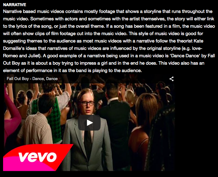
I also used the conventions of a narrative. There are three types of narrative (performance, abstract and narrative) and I feel I followed the conventions of both performance and narrative; performance because I have my artist playing the guitar and singing into a microphone and narrative because I feel the music video represents the lyrics of the song.

Overall I feel that my most dominant convention throughout my products is the theme colour of black and white as I feel that is a convention of pop-punk, but it also shows some editing. I think I have stuck to the conventions of real media products well as I have used them as guidelines whilst planning and making them. I think my products challenge forms and conventions as I think that having a full video in black and white has to have some meaning, which is why the very first shot starts with colour and then fades to black and white as it represents the words 'wasting away'. I have also tried to make it more interesting by making the locations interesting and making the editing fairly fast so that it goes with the beat of the song.
No comments:
Post a Comment