Tuesday 21 April 2015


Sunday 19 April 2015
Q1 In what ways does your media product use, develop or challenge forms and conventions of real media products?
Overall I feel that my products show conventions of real media products as they show continuity throughout them. This is important as real products need to having linking features throughout them so that it is obvious to the audience that all products are one and represent the same thing. I also think that my products show conventions of real media products as it includes elements of what a media product should include therefore making it look realistic rather than fake.
Here are the conventions of existing products compared to my own products.
Here are the conventions of existing products compared to my own products.
In terms of my digipak I thought that sticking to the conventions that apply to my genre was the most important as I want it to appeal to my target audience in order for it to become successful. I also liked the simplicity of just having a picture of the artist as a background cover, however if I were to change it I would maybe do a pattern and not include a picture of the artist at all as that is what the digipaks I have analysed have.
When I started doing my disk cover, the first idea that came into my head was to do a plain black background like the 1975 did (and You Me At Six but with the white background) however when I did it I thought it looked boring, so for both discs I changed them a bit whilst still sticking to the conventions of a real digipak. I applied the pattern to one of my discs as there is the smashed mirror on top of the black background, and to the other one I put a photo over it.
Much of my digipak has blurred pictures of my artist on as I thought this would promote the feeling of the whole album itself, and would link to the other products by creating a distorted feeling.
In terms of my album advert poster, I think I stuck to conventions of my genre as well because the plain image with as little information as possible promotes the idea that rock is a genre that concentrates mainly on music, therefore artists only want to promote their music and themselves as artists, rather than what the media portray them to be, where as pop is all about people promoting themselves for success and not their music.
The first idea I tried out stuck to the conventions of an album advert, however I realised the design is just as important and how just because you have the main conventions, it doesn't mean that your overall product will attract an audience.
In terms of my music video, I feel I followed conventions well as I not only included as many pop-punk elements I could (like costume, location, editing etc) but I also included as many conventions of a music video as I could. I also thought these where a good guideline for me to produce my video as they gave me ideas for the different shots because if I ran out of ideas I would look at the convention list e.g. when I didn't know what to include next in the music video, I looked at the list and it said 'variety of shots' therefore I just added a different shot at the location I was at and that meant I had a good location with many different shots.
The song obviously impacted what type of shots I thought I should use and one convention I feel is important and something that I followed was matching my editing to the beat of the song, like when the song says 'waiting for nothing' I broke up the syllables of the words so it was like wai-ting-for-no-thing and I cut the footage so it was as if we were getting closer to the artist on every beat of those lyrics.
I also used the conventions of a narrative. There are three types of narrative (performance, abstract and narrative) and I feel I followed the conventions of both performance and narrative; performance because I have my artist playing the guitar and singing into a microphone and narrative because I feel the music video represents the lyrics of the song.

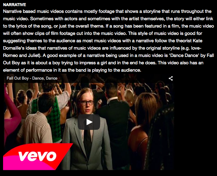
Overall I feel that my most dominant convention throughout my products is the theme colour of black and white as I feel that is a convention of pop-punk, but it also shows some editing. I think I have stuck to the conventions of real media products well as I have used them as guidelines whilst planning and making them. I think my products challenge forms and conventions as I think that having a full video in black and white has to have some meaning, which is why the very first shot starts with colour and then fades to black and white as it represents the words 'wasting away'. I have also tried to make it more interesting by making the locations interesting and making the editing fairly fast so that it goes with the beat of the song.
Saturday 18 April 2015
Q2 How effective is the combination of your main product and ancillary texts?
I think the combination of my music video, digipak and album advert is effective as I feel they represent my genre well. I also feel that because the pictures used in my ancillary texts are from my actual music video that they are more effective because they show how they are all part of the same promotion package and will affect my target audience and grab their attention.
I also think that because in my ancillary texts my cast member is wearing one of the outfits from the music video, it links the products together well as it makes it clear to the audience that they are all actually promoting the same thing. This is effective because it means that the over all look of the products create the same feeling as each other and portray the song well.
Things that I think are important to consider when making my products so that they can be as effective as possible when combined are:


All of the products from Hold Me Down have the same earthy house style as they all have the green and leafy effect. I feel that this shows how the products come from them and are all from the same album.
 Here she is on my front cover of my digipak;
 My left inside cover;
 My middle page;
 One of my CD's;
 My album advert;

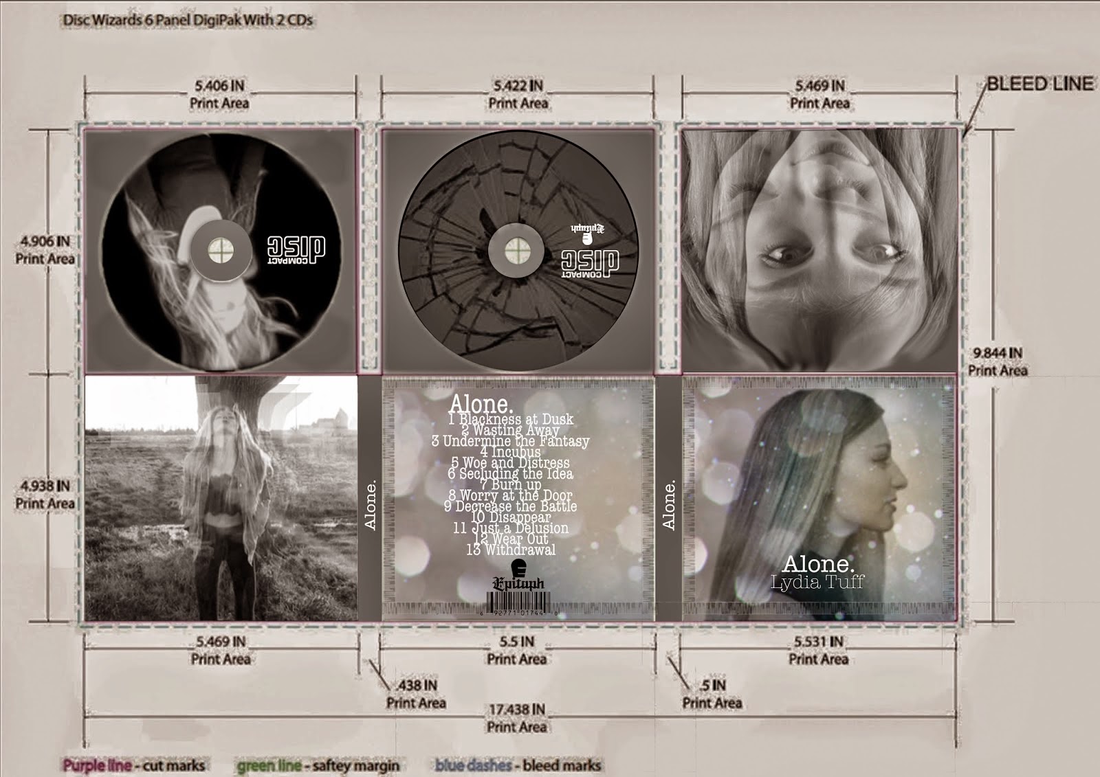 The aim of my digipak was to highlight the lyrics of the song as I feel there was a lot of negative feelings that needed to be represented. I think I did this by taking screen grabs from my music video as I tried to make my music video represent the feelings also, therefore my products have combined. The blurriness and distorted effect gives off the impression that the artists vision is how she says in the lyrics and connotes the fact that she's wasting away as she is no longer dominant in the picture.
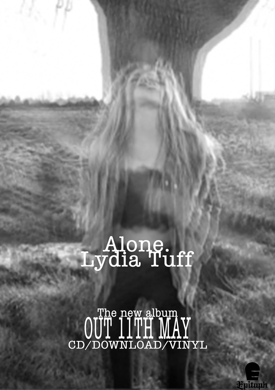 The aim of my poster was also to represent the wasting away effect because of the blurriness showing how she is going to eventually not exist. I also think that it shows how I am not particularly trying to aim at a mass audience, but a niche audience because of the fact that my artist doesn't exactly look like the stereotypical pop role model, which shows how I have stuck to the conventions of a pop-punk artist as they care more about the music due to the fact that they are more likely to be signed to an indie label, or don't change for the media if they are signed to one of the big 3.
I thought it would be a good idea to ask someone who is also doing media to get their opinion on whether or not my products combined are effective ad this is what she said.
I think she managed to pick up on my intended effect as she mentioned the fact that the genre is rock (pop-punk is a sub genre of rock) and recognised the fat that I have used the same fonts all the way through.
Obviously my music video, digipak and poster are black and white which is a factor in which makes them all combine and link.
This is similar to You Me At Six- Hold Me Down
All of the products from Hold Me Down have the same earthy house style as they all have the green and leafy effect. I feel that this shows how the products come from them and are all from the same album.
Another thing in which my products are effective in the way they combine is the feature artist as she appears on everything.
And all the way through my music video.
This is effective as it makes it clear who my artist is and who the products come from.
I also think the font I have used in my products shows continuity and combines my products which is effective as it means that people will see it as the logo of my artist as the font will always be used. I also think that it almost means that people will recognise it as the font that my artist uses and make them think of her when they see it.
The aim of my digipak was to highlight the lyrics of the song as I feel there was a lot of negative feelings that needed to be represented. I think I did this by taking screen grabs from my music video as I tried to make my music video represent the feelings also, therefore my products have combined. The blurriness and distorted effect gives off the impression that the artists vision is how she says in the lyrics and connotes the fact that she's wasting away as she is no longer dominant in the picture.The aim of my poster was also to represent the wasting away effect because of the blurriness showing how she is going to eventually not exist. I also think that it shows how I am not particularly trying to aim at a mass audience, but a niche audience because of the fact that my artist doesn't exactly look like the stereotypical pop role model, which shows how I have stuck to the conventions of a pop-punk artist as they care more about the music due to the fact that they are more likely to be signed to an indie label, or don't change for the media if they are signed to one of the big 3.
One thing I think I could have improved on in the combination of my products is promoting them as I haven't included where you can buy my album, which shows how my products may not be noticed as much as others and how my products combining will make less of an impact because they are more likely to reach a niche audience.
Overall I think the combination of my main product and ancillary texts are effective as they show continuity and similitude. These are important as they mean that the products promote my artist and her song which is what the aim of the brief was (a promotion package), therefore I think I have fulfilled my aim and successfully made three linking products.
Friday 17 April 2015
Q3 What have you learned from your audience feedback?
The first thing I did when answering this question was look back at my audience research I did before making my actual music video.
These are the questions I asked on my questionnaire.


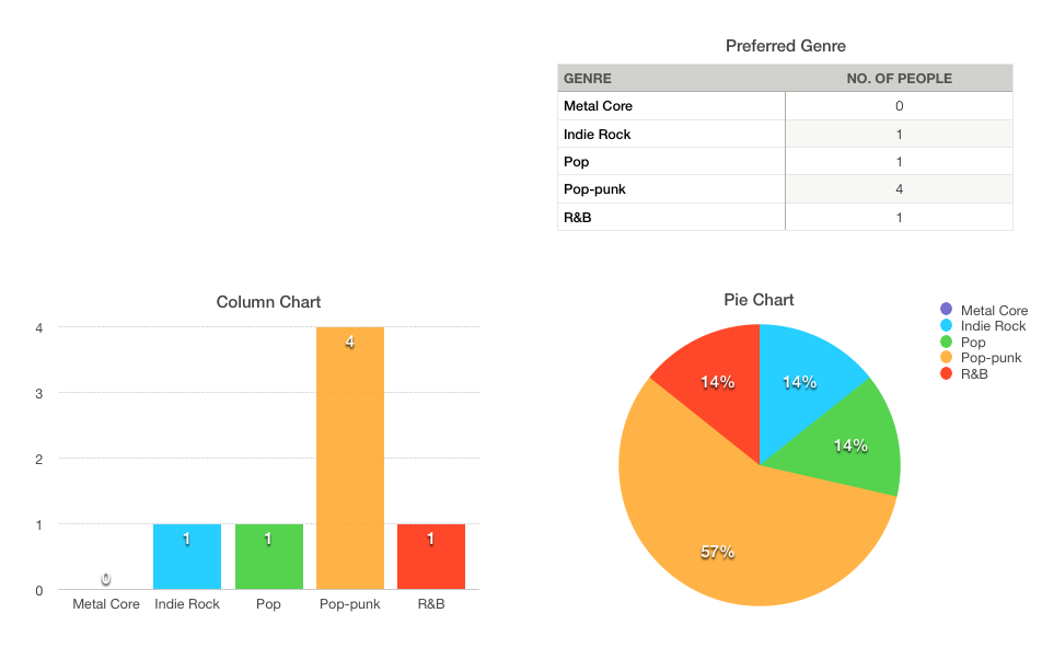
The first chart is on the preferred genre. In this case, I listened to what the audience preferred as they voted pop-punk. I also wanted to do pop-punk anyway because I feel it is a good genre to stick to conventions.
 The next chart I did was on the gender of the people viewing my blog. The results show that only females have been looking/voting on my blog and I feel this shows how using a female as my artist is useful based on this poll outcome as it means I can create more of a role model and create my products to attract to the female audience.
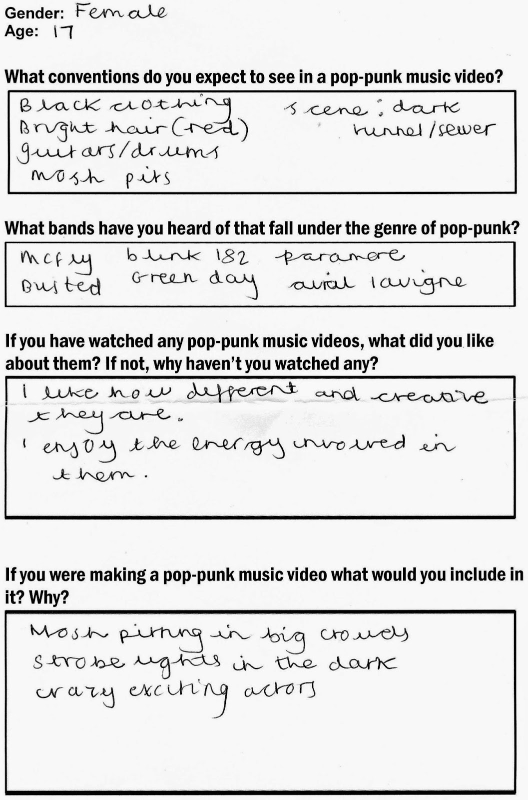
One of the things I learned from my questions is that asking a variety of people who listen to different music to pop-punk is that they will give me the stereotypical view and state the expected conventions of a pop-punk music video or artist. This made me think about Tessa Perkins' theory because I was thinking of including some of the things the people I asked came up with, which shows how stereotypes come from somewhere as whilst I was analysing pop-punk music videos many of those things appeared in them.
Here I have asked two completely different people as the male is 21 and the female is 17, however both people came up with the same ideas which I felt showed the stereotyping coming through. These also weren't part of my target audience, however they have heard of many pop-punk bands, which shows how pop-punk can still be popular and make it into the charts as many of the bands they have mentioned have done.
I purposely didn't do much audience research just because I had an idea in my head already of what I wanted my video to look like and what narrative/s I wanted to follow. I think doing the generic questionnaire to people around the 17-21 age bracket was effective in the way that it gave me many ideas to use in my music video without stretching from my original ideas, by sticking to my target audience age and by sticking to stereotypes and conventions of pop-punk which made the genre clear to the audience.
I did some charts on my pre production polls that I posted on my blogs.
The first chart is on the preferred genre. In this case, I listened to what the audience preferred as they voted pop-punk. I also wanted to do pop-punk anyway because I feel it is a good genre to stick to conventions.
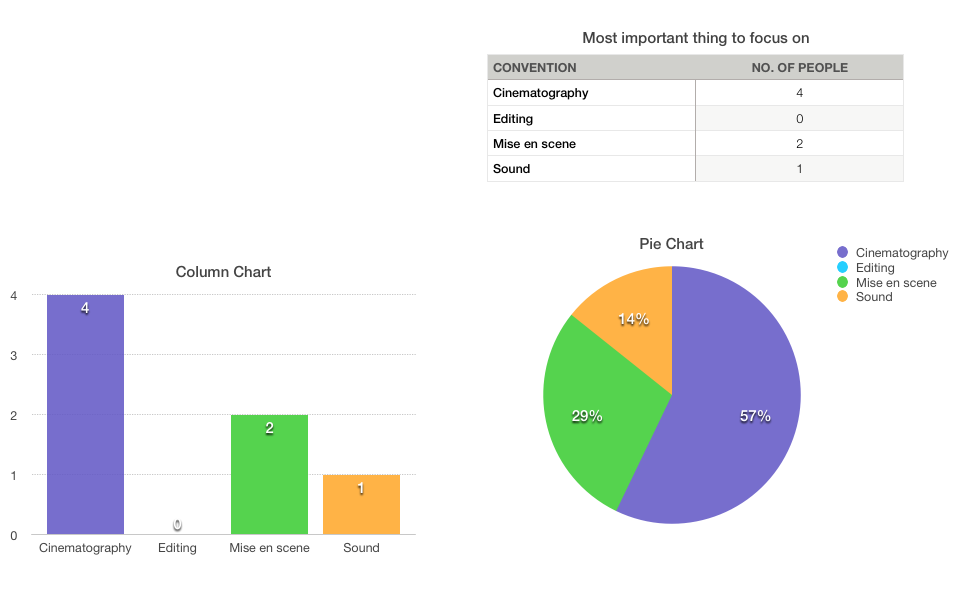
I also did a poll on what people think the most important convention is. The outcome was cinematography therefore I was motivated on concentrating on what the shots looked like and including different varieties of shots in order to make it look aesthetically pleasing.

Finally, the last poll I did was on what people thought would be the best narrative. The outcome was abstract however some people did vote for a narrative, therefore I tried to interpret both into my video and ancillary texts in order to make my product more versatile.


 After I took a look at the statistics, I realised that the potential target audience for my products are likely to be from the United States and the UK due to the fact that a lot more people have viewed my blog from there than they have other countries.
I did a target audience profile because I felt that it was important to show who I expect will listen to the album that I have tried to promote and I think it shows how I have taken into consideration the interests that my audience will have and what magazines they read.
I also think that I have created a good role model based on this profile as I think my artist shares things with 'Hannah White' therefore she will be more appealing and seem like a real person, rather than someone who could be potentially be seen as intimidating and fake like a pop artist like Rita Ora.
I also think that because things are so much more accessible because of the internet and social media, my artist will be discovered in ways like that because my artist will be able to promote things herself for free and reach an audience that chose to follow and listen to her. I did some audience research after I finished my product by creating a twitter account for my artist and promoted her music video.
Doing this meant that the audience could also interact with my artist and share their own opinions which is very helpful as it means that the next promotion package my artist does will be able to be influenced by the feedback I got back from them and make them want to listen to her more.
Blogger also provided me with the viewing statistics of my blog which I thought was extremely helpful as it gave me an idea of who is actually viewing my blog and provides me with information on who my target audience should be.
Thursday 16 April 2015
Q4 How did you use media technologies in the construction and research, planning and evaluation stages?
The first thing I did was talk about how I have used different technologies in my products and what I used them for.
 Here are the notes I used for making this video.
Here is a list of some of the main technology I used in order to complete my planing and research, production and post production.


 I used SlideShare to put my presentations together,as the website allowed me to put my powerpoint onto a slide show type thing. This allowed my blog and my presentation to look neater and more professional as it made my powerpoints flow and go in an order I wanted them to be seen . Also, it was an easy website to use, as it only took a few moments to upload a file. I also merged the use of BlogSpot and the use of SlideShare together as I was able to embed the SlideShare’s onto my blog easily. It was also extremely easy to navigate the SlideShare by selecting the arrows to move onto the next slide.

Here is a list of some of the main technology I used in order to complete my planing and research, production and post production.
Microsoft Powerpoint was helpful in terms of presentations as it made it easier to present my ideas and upload them onto things like SlideShare which enabled me to upload it to my blog. It also meant that when I did have several ideas, such as the clothing and make-up ideas, I could collectively adapt them all together within a powerpoint. I could also adapt the colours, fonts, texts, images and animations in a personal way which I felt was appropriate. Therefore, this use of technology was extremely beneficial as I was able to present my ideas in a more attractive and appealing way.
I used the internet for endless aspects of the planning and research stages. For example, I used Google images to collect appropriate images of relevant things, which I would need, such as singers, performers, digipaks and magazine adverts. This allowed me to present my ideas with photographs and images and was aesthetically pleasing when I uploaded them onto blogger.
I used SlideShare to put my presentations together,as the website allowed me to put my powerpoint onto a slide show type thing. This allowed my blog and my presentation to look neater and more professional as it made my powerpoints flow and go in an order I wanted them to be seen . Also, it was an easy website to use, as it only took a few moments to upload a file. I also merged the use of BlogSpot and the use of SlideShare together as I was able to embed the SlideShare’s onto my blog easily. It was also extremely easy to navigate the SlideShare by selecting the arrows to move onto the next slide.
Twitter was helpful with the promotion of my artists product and allowed me to get ideas and opinions from real existing artists on their own products, allowing me to transfer these characteristics to my artist.
I have already discussed the uses of the main media technology that allowed me to actually produce my products (photoshop and iMovie). I feel I have developed a lot since my foundation portfolio in using them as instead of taking more than a week to produce a still imaged product, it took me around 1 day to fully complete both my digipak and poster. On the other hand working with moving image was something new to me so the technology I had to use to help me produce my music video where things like the internet and youtube which provided tutorials on how to use it.
I have already discussed the uses of the main media technology that allowed me to actually produce my products (photoshop and iMovie). I feel I have developed a lot since my foundation portfolio in using them as instead of taking more than a week to produce a still imaged product, it took me around 1 day to fully complete both my digipak and poster. On the other hand working with moving image was something new to me so the technology I had to use to help me produce my music video where things like the internet and youtube which provided tutorials on how to use it.
Saturday 11 April 2015
The making of my poster
Here is a demonstration of how I got the final look of my poster. I enjoyed making it as I liked the effect of making the duplicate more opaque as making it blurry links to the title of the song 'wasting away' as the distortion shows how she is becoming less and less in our sights therefore she is disappearing.
Thursday 9 April 2015
The making of my digipak
Here is how I made my digipak. I made my colour scheme black/white/grey and I feel I kept that well throughout. I also think that it links well with my other products and I think that it is clear that they come from the same artist due to the fact that they all feature at least one picture of her.
Wednesday 25 March 2015
Creating my track list
When creating my track list, I went back to my research on pop-punk albums and looked at the first 3 albums from the 'frequently mentioned albums'.
 I thought it would be a good idea to look at their track lists so that I could see the average number of tracks on a pop-punk album, and to see the types of names the songs are given
Enema of the State- Blink 182


This album has 13 tracks. One thing I have noticed is that all of these albums have at least one explicit song which shows how the target audience isn't for children.
After looking at these track list I worked out the average number of tracks:
13+15+12=40
40/3=13.333
Average number of tracks (and how long my own track list will be): 13
I also thought of the idea of coming up with words to do with 'wasting away' and what emotions it portrays.


Enema of the State- Blink 182
This album has 12 tracks and by looking at the names of the tracks, we can get a sense of who the target audience is as it includes the words 'college' and 'party' and then theres also 'what's my age again?' which all suggest that they are aimed at people who enjoy themselves and don't take themselves to seriously, and are likely to be in their late teens to early twenties.
Dookie- Green Day
This album has 15 tracks. The names of the tracks seem to portray emotions which could suggest that Green Day have written about their own feelings maybe. I also like the fact that they have named their tracks with one word like 'Burnout', 'Chump', 'Longview' and 'she' as it makes them memorable.
All Killer, No Filler- Sum 41

This album has 13 tracks. One thing I have noticed is that all of these albums have at least one explicit song which shows how the target audience isn't for children.
After looking at these track list I worked out the average number of tracks:
13+15+12=40
40/3=13.333
Average number of tracks (and how long my own track list will be): 13
I also thought of the idea of coming up with words to do with 'wasting away' and what emotions it portrays.
- Loneliness
- Unhappiness
- Darkness
- Dream
- Waste
I then searched on a thesaurus different words for the ones I came up with.
Track names I have come up with:
- Blackness at Dusk
- Wasting Away
- Undermine the Fantasy
- Incubus
- Woe and Distress
- Secluding the Idea
- Burn up
- Worry at the Door
- Decrease the Battle
- Disappear
- Just a Delusion
- Wear Out
- Withdrawal
Creating my album name
Many artists use one of the names of their tracks as their album name however I thought that coming up with a new one would be better.
A random idea I thought up was using every letter of the alphabet to come up with different words that portray the same feeling as the track names. I think using one word as the title will be more effective as it means it will stand out and make it more memorable.
A-alone
B-broken
C-closer
D-dead
E-erased
F-found
G-ghost
H-hated
I-inside
J-juxtaposed
K-kindless
L-lost
M-misused
N-nothing
O-open
P-peace
Q-quitter
R-reselected
S-saved
T-tired
U-undone
V-violent
W-waiting
I thought this was a good idea as it allowed me to explore the different words that come with the different letters.
My favourite word for the title of my album is 'alone' as I feel it represents the names of all of the tracks well, but also gives the same emotion as 'wasting away' which is the song in my music video.
I also took a look at existing pop-punk albums to see what they where called.

American Idiot- Green Day
A random idea I thought up was using every letter of the alphabet to come up with different words that portray the same feeling as the track names. I think using one word as the title will be more effective as it means it will stand out and make it more memorable.
A-alone
B-broken
C-closer
D-dead
E-erased
F-found
G-ghost
H-hated
I-inside
J-juxtaposed
K-kindless
L-lost
M-misused
N-nothing
O-open
P-peace
Q-quitter
R-reselected
S-saved
T-tired
U-undone
V-violent
W-waiting
I thought this was a good idea as it allowed me to explore the different words that come with the different letters.
My favourite word for the title of my album is 'alone' as I feel it represents the names of all of the tracks well, but also gives the same emotion as 'wasting away' which is the song in my music video.
I also took a look at existing pop-punk albums to see what they where called.
I then researched what the albums where about to see whether or not the album name linked with the song meanings.
This album is, as described by the band, a punk rock opera. Clocking in at about one hour, and containing two nine-plus minute songs, American Idiot certainly is ambitious for a band who hasn't seen major, multi-platinum success since the release of their major record label debut, Dookie.
Now, I will take you in-depth, reviewing the album song-by-song, and describing the "story" created by the album.
American Idiot
The song's title track is just under three minutes long, and serves as a very good introduction to the album. It seems to show a group that is fed-up with modern life, and are sick of a nation run by the media and hysteria. They shout, We are not the ones who're meant to follow and everything isn't meant to be okay. The underlying meaning and implications of this track are masked by a catchy guitar chord progression and lyrics, but still is a fun track.
Jesus of Suburbia
This track is the first of two longer tracks on the album, at 9:08. This song introduces the titular Jesus of Suburbia, a kind of anti-hero created by Green Day's frontman, Billie Joe Armstrong. He lives on a steady diet of soda pop and Ritalin and may be the singular manifestation of the voices in the preceding track. He feels that the world is a land of make-believe, that don't believe in [him].
This song is split up into 5 sections: Jesus of Suburbia, City of the Damned, I Don't Care, Dearly Beloved, and Tales From Another Broken Home. Each smaller part of the whole song describes part of Jesus of Suburbia's life. City of the Damned describes the town that he lives in, a place that he calls the city of the dead and the city of the damned. He also claims, no one seems to care about anything in the city.
In I Don't Care, the Jesus of Suburbia seems to finally lash out with his anger, repeatedly exclaiming, I don't care if you don't, I don't care if you don't, I don't care if you don't care, and then seemingly makes a call to arms to the other jaded youths of the world, screaming, we are the kids of war and peace, from Anaheim to the Middle East, we are the stories and disciples of, the Jesus of Suburbia!
In I Don't Care, the Jesus of Suburbia seems to finally lash out with his anger, repeatedly exclaiming, I don't care if you don't, I don't care if you don't, I don't care if you don't care, and then seemingly makes a call to arms to the other jaded youths of the world, screaming, we are the kids of war and peace, from Anaheim to the Middle East, we are the stories and disciples of, the Jesus of Suburbia!
In Dearly Beloved, Jesus's call has been answered and we hear from the new followers who say nobody's perfect and [they] stand accused, for a lack of a better word, and that's [their] best excuse. At the end of the song, during Tales From Another Broken Home, Jesus of Suburbia and his followers decide to get out of the town and leave to, what is only referred to as, The City. They proclaim that they don't have any shame, [they] won't apologize.
Holiday
This track sees Jesus and his followers arrive in the City. They, seemingly having only known suburbian, small-town life, are amazed by the sights in the city. They shout, This is the dawning of the rest of [their] lives, on Holiday! There is a spoken interlude, which is a fairly obvious attack on the government of the US, seemingly regarding then-President George Bush's invasion of Iraq.
Boulevard of Broken Dreams
This track, one of my favorites on the album, sees Jesus of Suburbia, after the novelty of the City wears off, being abandoned by his followers and lamenting about being alone. He says, My shadow's the only one that walks beside me, my shallow heart's the only thing that's beating. Green Day's frontman Billie Joe Armstrong has said, "If Holiday is the party, then this song is the resulting hangover." (Fun fact: the song's music video won the 2005 VMA for Video of the Year.)
Are We the Waiting
Another excellent song on the album, Are We the Waiting seems to me to be a slight continuation of the preceding track. In this song, the Jesus of Suburbia wonders about his future, and wonders why he seems to be waiting to live life. He believes that the Jesus of Suburbia is a lie and repeatedly is screaming, 'Are we? We are the waiting.
St. Jimmy
This song introduces the next major character of the album, St. Jimmy. St. Jimmy is a "punk freedom-fighter", as described by Armstrong. St. Jimmy has grown up in the city, and says that he is product of war and fear that we've been victimized. He also claims to be the patron saint of denial, with an angel face and a taste for suicidal. Jesus of Suburbia is fascinated by the new person in his life.
Give Me Novocaine
In this track, another favorite of mine, we learn that St. Jimmy is a drug dealer after he tries to sell Novocaine to the Jesus of Suburbia. In this song, Jesus of Suburbia also describes the escape that he feels in the City and with Jimmy, as he takes drugs for the first time. The melody of this song has the feeling of being high on drugs, which are again what the song is about.
She's a Rebel
This track is the introduction of Whatsername, another resident of the city. Whatsername is described by Armstrong as "St. Jimmy's nemesis in a lot of ways." She is a vigilante, missing link on the brink of destruction. Jesus of Suburbia asks, Is she trouble like I'm trouble? It is a love-at-first-sight reaction that Whatsername is implied to not share. Again, not one of my favorite tracks on the album, but it's still a good song. St. Jimmy doesn't like Whastsername, and actively tries to convince Jesus that she isn't good for him.
Extraordinary Girl
This song describes what is going on in Whatsername's head. She is insecure and doesn't like what she knows is there. She sees the mirror of herself, an image she wants to sell, to anyone willing to buy. The Jesus of Suburbia steals the image in her kiss, from her heart's apocolypse. And as Whatsername is all alone again, wiping the tears from her eyes, Jesus feels like dying, and she get sick of crying.
Letterbomb
In this fast-paced, loud song, Whatsername lashes out against Jesus of Suburbia and his love. She tauntingly sings, nobody likes you, everyone left you, they're all out without you, having fun! In the lyric booklet for the album, this song is drawn as a literal letter, while within the album's story, it is metaphoric. Then she screams you'd better run for your f**king life! and It's not over before it's too late, there is nothing left to analyze! She also says, you're not the Jesus of Suburbia, the St. Jimmy is a figment of, your father's rage and your mother's love, made me the idiot America!
Wake Me Up When September Ends
Armstrong wrote this song about his father, who passed away when Armstrong was 10, in 1982. The song, in some continuities of the album, is dated September 10th, which was the date of Billie Joe Armstrong's father's death. In this song, the Jesus of Suburbia is mourning the loss of Whatsername, and realizing that his broken home life has made him into this: a madman. In this song, he also finally comes to comprehend what Whatsername meant, and that St. Jimmy is just a manifestation of Jesus's rage.
Homecoming
This is the album's longest track, (clocking in at 9:16), is my personal favorite, and is split into six different subtracks: Homecoming, The Death of St. Jimmy, East 12th Street, Nobody Likes You, Rock and Roll Girlfriend, and We're Coming Home Again. In The Death of St. Jimmy, Jesus of Suburbia kills off his alter-ego, which manifests itself as Jimmy [blowing] his brains out into the bay.
In East 12th Street, Jesus of Suburbia tries to get a real job and lead a normal relationship, but it doesn't work out so well. He's in his own world and he's daydreaming and would rather be doing something else now, like cigarettes and coffee with the underbelly, and his unnamed girlfriend leaves, saying she had enough and he had plenty.
Nobody Likes You is Jesus being taunted by Whatsername's last words to him, nobody likes you, everyone left you, they're all out without you, having fun. He realizes that Whatsername was right, that he is all alone. (To me, this part brings back the memory of Boulevard of Broken Dreams)
Rock and Roll Girlfriend is the thought of an idyllic life that Jesus of Suburbia is wishing for: he is clean, he has a girlfriend and a few kids, and he's in a band. Jesus longs for this simple lifestyle, and to leave the City and the memories it's held for him.
We're Coming Home Again sees Jesus of Suburbia leaving the City and returning home, proclaiming Home, we're coming home again over and over again.
Whatsername
In the album's closing track, Jesus of Suburbia wonders about Whatsername and what has become of her. He references their relationship's poor ending, saying I made a point to burn all of the photographs, she went away and then I took a different path, and then realizes that he didn't know her all that well, reminding himself I remember the face but I can't recall the name, now I wonder how Whatsername has been.
He says, If my memory serves me right, I'll never turn back time, forgetting you but not the time. This is another excellent track.
He says, If my memory serves me right, I'll never turn back time, forgetting you but not the time. This is another excellent track.
The meaning behind the tracks and albums is portrayed in the album name because one of the songs is called american idiot, therefore people listening to the song will know what that is about, and then transfer those emotions into the rest of the album.
Take off your pants and jacket- Blink 182
Take Off Your Pants and Jacket is the fourth studio album by the American pop punk band Blink-182. Produced by Jerry Finn, the album was released on June 12, 2001, through MCA Records. The band had spent much of the previous year traveling and supporting the album Enema of the State(1999), which launched the band's mainstream career. The title is a tongue-in-cheek pun on male masturbation ("take off your pants and jack it"). The cover art has icons for each member of the trio: an airplane ("take off"), a pair of pants and a jacket. Several different editions were released with additional bonus tracks.
The album was primarily recorded over three months at Signature Sound in San Diego. During the sessions, MCA executives pressured the band to retain the sound that helped their previous album sell millions. As such, Take Off Your Pants and Jacket continues the pop punk sound that the group honed and made famous, albeit with a heavier tone inspired by groups such as Fugazi and Refused. Regarding lyrics, the album has been referred to as a concept album chronicling adolescence, with songs dedicated to first dates, fighting authority and teenage parties. Due to differing opinions on direction, the trio worked in opposition to one another for the first time, and the sessions sometimes became contentious.
The album had near-immediate success, becoming the first punk rock-identified record to debut at number one on the Billboard 200 and being certified double platinum within three weeks. The album produced three hit singles — "The Rock Show", "First Date" and "Stay Together for the Kids" — that were top ten hits on modern rock charts. Critical impressions of the record were generally positive, commending the record's expansion on teenage themes; others viewed this as its weakness. To support the record, the band co-headlined the Pop Disaster Tour with Green Day. A European tour was canceled in the wake of the September 11 attacks. Take Off Your Pants and Jacket has sold over 14 million copies worldwide.
Blink 182 are known for being typical american punks and I think this is portrayed in the album name because of where it originated from.
Americana- The Offspring
Americana is the fifth studio album by the American punk rock band The Offspring, released on November 17, 1998 (see 1998 in music). Following a worldwide tour in support of its previous album, Ixnay on the Hombre (1997), The Offspring commenced work on a new album. The music on the album marked a change, expanding their sound and exploring more pop punk elements.
Americana was a major commercial success, debuting at number six on the Billboard 200 with around 175,000 copies sold in its first week and peaking at number two for two nonconsecutive weeks, spending 22 nonconsecutive weeks in the top 10, becoming the Offspring's highest ever chart position. It is the band's second best selling album to their 1994 breakout Smash. Americana has sold more than 10 million copies worldwide, with over 9 million copies certified, while achieving 5x platinum status alone in the United States for 5 million copies shipped.
The album contains the hit singles "Pretty Fly (for a White Guy)", "Why Don't You Get a Job?" and "The Kids Aren't Alright" being the band's 3 biggest hits to date all crossing over from mainstream rock and alternative rock radio to Top 40 pop radio stations and sharing the similar success to the singles from Smash. "She's Got Issues" was the last single from the album and it only received some moderate success and it was not as popular or successful as its 3 prior hit singles. The singles (except "She's Got Issues") were included on the band's Greatest Hits compilation. The CD version of the album also includes the music video for "The Meaning Of Life", a song from their 1997 album Ixnay On the Hombre, playable on DVD ROM. Americana was nominated for the 1999 MTV Europe Music Awards for "Best Album", but lost to Boyzone's By Request. The Offspring supported the album with a worldwide tour and appeared at the infamous Woodstock 1999, where their performance was broadcast live on pay-per-view television. The band will play Americana in its entirety for the first time in 2015, at Anmesia Rock Fest.[5] It is also the last Offspring album to contain a hidden track.
How I got the pictures for my ancillary texts
The first thing I thought when thinking about taking pictures for my ancillary texts was that I would do a photoshoot in the green room at college and have my cast member pose for a photoshoot. However I then came up with the idea to use still shots from my actual footage used in my music video as my music video and ancillary texts are supposed to link in order to make the products look like they come from the same artist and are to promote the same thing.
The first thing I did was go through the footage on my music video and picked out any shots that I thought looked particularly good and would allow me to get a good still shot from.

Some specific shots that caught my interest where:


This is the edit of picture 1. I felt that it didn't look very good due to the fact that her head wasn't in the full frame therefore I will not be using this in any of my ancillary texts.
Picture 2 also has the same problem as picture 1 and I will also not be using it.
I like picture 5 and think it would make a good album cover. I edited out the microphone as I think it looks better and more professional. I also think that this shot would look great with my drawn up plan.
Picture 6 is a lot like picture 5, the only thing that is different is her facial expression and I feel that picture 4 looks the best out of the two
I like picture 7 because it looks more abstract and I think it would look good on the advert.
I also like picture 8 because it's an action shot however you can hardly see her face and I like picture 7 a lot more.
I like picture 9 also as it is a lot like picture 7.
The first thing I did was go through the footage on my music video and picked out any shots that I thought looked particularly good and would allow me to get a good still shot from.
Some specific shots that caught my interest where:
After watching them a few times, I started pausing them on frames I thought looked good. I kept them black and white as my whole music video is, therefore it means my products will link.
These are the still shots I thought looked good:
Picture 1
Picture 2
Picture 3
Picture 4
Picture 5
Picture 6
Picture 7
Picture 8
Picture 9
I then started editing them on Photoshop to see what would look best with my final plan of what I want my album cover and poster to look like.
(post drawn up draft)
This is the edit of picture 1. I felt that it didn't look very good due to the fact that her head wasn't in the full frame therefore I will not be using this in any of my ancillary texts.
Picture 2 also has the same problem as picture 1 and I will also not be using it.
I like picture 3 and feel it would look good on the album cover, however the lighting is a bit off and it isn't like many album covers by artists therefore it makes me think whether or not it would appeal to an audience.
I like picture 5 and think it would make a good album cover. I edited out the microphone as I think it looks better and more professional. I also think that this shot would look great with my drawn up plan.
Picture 6 is a lot like picture 5, the only thing that is different is her facial expression and I feel that picture 4 looks the best out of the two
I like picture 7 because it looks more abstract and I think it would look good on the advert.
I also like picture 8 because it's an action shot however you can hardly see her face and I like picture 7 a lot more.
I like picture 9 also as it is a lot like picture 7.
Subscribe to:
Posts (Atom)