Tuesday 21 April 2015


Sunday 19 April 2015
Q1 In what ways does your media product use, develop or challenge forms and conventions of real media products?
Overall I feel that my products show conventions of real media products as they show continuity throughout them. This is important as real products need to having linking features throughout them so that it is obvious to the audience that all products are one and represent the same thing. I also think that my products show conventions of real media products as it includes elements of what a media product should include therefore making it look realistic rather than fake.
Here are the conventions of existing products compared to my own products.
Here are the conventions of existing products compared to my own products.
In terms of my digipak I thought that sticking to the conventions that apply to my genre was the most important as I want it to appeal to my target audience in order for it to become successful. I also liked the simplicity of just having a picture of the artist as a background cover, however if I were to change it I would maybe do a pattern and not include a picture of the artist at all as that is what the digipaks I have analysed have.
When I started doing my disk cover, the first idea that came into my head was to do a plain black background like the 1975 did (and You Me At Six but with the white background) however when I did it I thought it looked boring, so for both discs I changed them a bit whilst still sticking to the conventions of a real digipak. I applied the pattern to one of my discs as there is the smashed mirror on top of the black background, and to the other one I put a photo over it.
Much of my digipak has blurred pictures of my artist on as I thought this would promote the feeling of the whole album itself, and would link to the other products by creating a distorted feeling.
In terms of my album advert poster, I think I stuck to conventions of my genre as well because the plain image with as little information as possible promotes the idea that rock is a genre that concentrates mainly on music, therefore artists only want to promote their music and themselves as artists, rather than what the media portray them to be, where as pop is all about people promoting themselves for success and not their music.
The first idea I tried out stuck to the conventions of an album advert, however I realised the design is just as important and how just because you have the main conventions, it doesn't mean that your overall product will attract an audience.
In terms of my music video, I feel I followed conventions well as I not only included as many pop-punk elements I could (like costume, location, editing etc) but I also included as many conventions of a music video as I could. I also thought these where a good guideline for me to produce my video as they gave me ideas for the different shots because if I ran out of ideas I would look at the convention list e.g. when I didn't know what to include next in the music video, I looked at the list and it said 'variety of shots' therefore I just added a different shot at the location I was at and that meant I had a good location with many different shots.
The song obviously impacted what type of shots I thought I should use and one convention I feel is important and something that I followed was matching my editing to the beat of the song, like when the song says 'waiting for nothing' I broke up the syllables of the words so it was like wai-ting-for-no-thing and I cut the footage so it was as if we were getting closer to the artist on every beat of those lyrics.
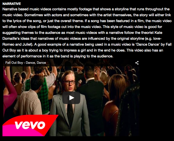
I also used the conventions of a narrative. There are three types of narrative (performance, abstract and narrative) and I feel I followed the conventions of both performance and narrative; performance because I have my artist playing the guitar and singing into a microphone and narrative because I feel the music video represents the lyrics of the song.

Overall I feel that my most dominant convention throughout my products is the theme colour of black and white as I feel that is a convention of pop-punk, but it also shows some editing. I think I have stuck to the conventions of real media products well as I have used them as guidelines whilst planning and making them. I think my products challenge forms and conventions as I think that having a full video in black and white has to have some meaning, which is why the very first shot starts with colour and then fades to black and white as it represents the words 'wasting away'. I have also tried to make it more interesting by making the locations interesting and making the editing fairly fast so that it goes with the beat of the song.
Saturday 18 April 2015
Q2 How effective is the combination of your main product and ancillary texts?
I think the combination of my music video, digipak and album advert is effective as I feel they represent my genre well. I also feel that because the pictures used in my ancillary texts are from my actual music video that they are more effective because they show how they are all part of the same promotion package and will affect my target audience and grab their attention.
I also think that because in my ancillary texts my cast member is wearing one of the outfits from the music video, it links the products together well as it makes it clear to the audience that they are all actually promoting the same thing. This is effective because it means that the over all look of the products create the same feeling as each other and portray the song well.
Things that I think are important to consider when making my products so that they can be as effective as possible when combined are:


All of the products from Hold Me Down have the same earthy house style as they all have the green and leafy effect. I feel that this shows how the products come from them and are all from the same album.
 Here she is on my front cover of my digipak;
 My left inside cover;
 My middle page;
 One of my CD's;
 My album advert;

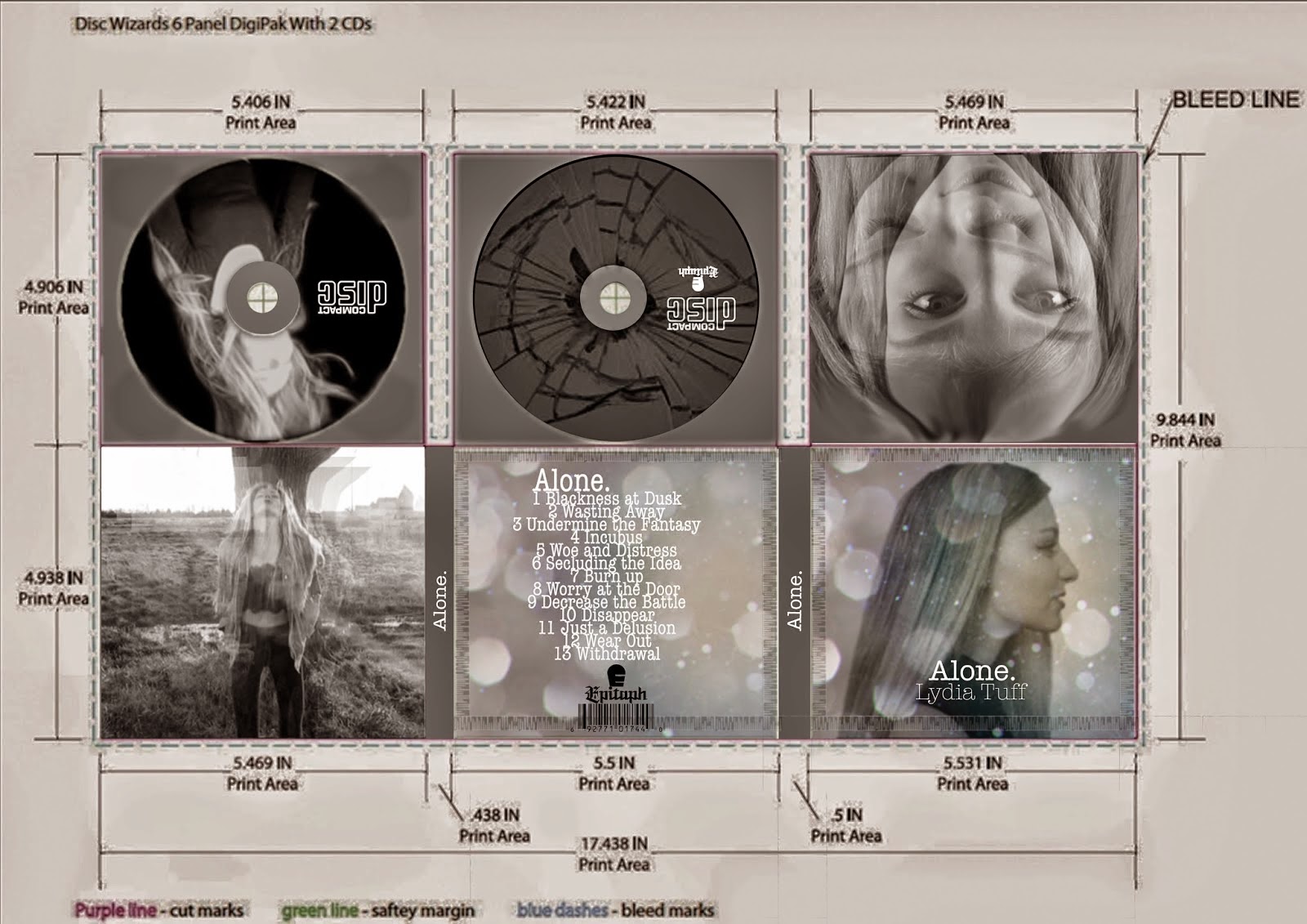 The aim of my digipak was to highlight the lyrics of the song as I feel there was a lot of negative feelings that needed to be represented. I think I did this by taking screen grabs from my music video as I tried to make my music video represent the feelings also, therefore my products have combined. The blurriness and distorted effect gives off the impression that the artists vision is how she says in the lyrics and connotes the fact that she's wasting away as she is no longer dominant in the picture.
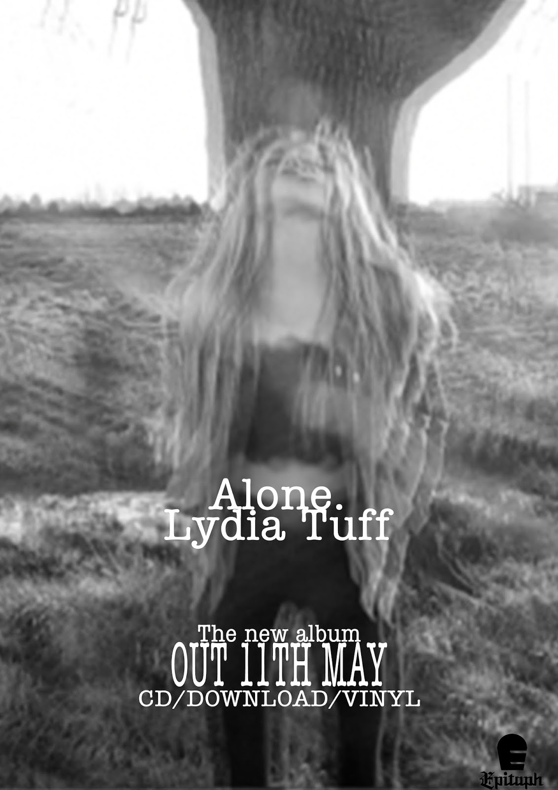 The aim of my poster was also to represent the wasting away effect because of the blurriness showing how she is going to eventually not exist. I also think that it shows how I am not particularly trying to aim at a mass audience, but a niche audience because of the fact that my artist doesn't exactly look like the stereotypical pop role model, which shows how I have stuck to the conventions of a pop-punk artist as they care more about the music due to the fact that they are more likely to be signed to an indie label, or don't change for the media if they are signed to one of the big 3.
I thought it would be a good idea to ask someone who is also doing media to get their opinion on whether or not my products combined are effective ad this is what she said.
I think she managed to pick up on my intended effect as she mentioned the fact that the genre is rock (pop-punk is a sub genre of rock) and recognised the fat that I have used the same fonts all the way through.
Obviously my music video, digipak and poster are black and white which is a factor in which makes them all combine and link.
This is similar to You Me At Six- Hold Me Down
All of the products from Hold Me Down have the same earthy house style as they all have the green and leafy effect. I feel that this shows how the products come from them and are all from the same album.
Another thing in which my products are effective in the way they combine is the feature artist as she appears on everything.
And all the way through my music video.
This is effective as it makes it clear who my artist is and who the products come from.
I also think the font I have used in my products shows continuity and combines my products which is effective as it means that people will see it as the logo of my artist as the font will always be used. I also think that it almost means that people will recognise it as the font that my artist uses and make them think of her when they see it.
The aim of my digipak was to highlight the lyrics of the song as I feel there was a lot of negative feelings that needed to be represented. I think I did this by taking screen grabs from my music video as I tried to make my music video represent the feelings also, therefore my products have combined. The blurriness and distorted effect gives off the impression that the artists vision is how she says in the lyrics and connotes the fact that she's wasting away as she is no longer dominant in the picture.The aim of my poster was also to represent the wasting away effect because of the blurriness showing how she is going to eventually not exist. I also think that it shows how I am not particularly trying to aim at a mass audience, but a niche audience because of the fact that my artist doesn't exactly look like the stereotypical pop role model, which shows how I have stuck to the conventions of a pop-punk artist as they care more about the music due to the fact that they are more likely to be signed to an indie label, or don't change for the media if they are signed to one of the big 3.
One thing I think I could have improved on in the combination of my products is promoting them as I haven't included where you can buy my album, which shows how my products may not be noticed as much as others and how my products combining will make less of an impact because they are more likely to reach a niche audience.
Overall I think the combination of my main product and ancillary texts are effective as they show continuity and similitude. These are important as they mean that the products promote my artist and her song which is what the aim of the brief was (a promotion package), therefore I think I have fulfilled my aim and successfully made three linking products.
Friday 17 April 2015
Q3 What have you learned from your audience feedback?
The first thing I did when answering this question was look back at my audience research I did before making my actual music video.
These are the questions I asked on my questionnaire.


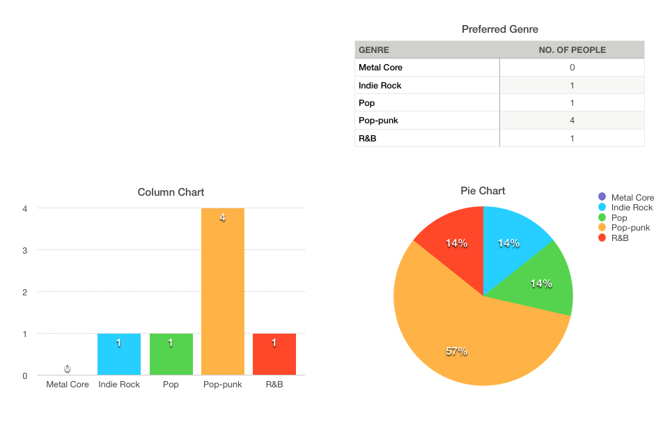
The first chart is on the preferred genre. In this case, I listened to what the audience preferred as they voted pop-punk. I also wanted to do pop-punk anyway because I feel it is a good genre to stick to conventions.
 The next chart I did was on the gender of the people viewing my blog. The results show that only females have been looking/voting on my blog and I feel this shows how using a female as my artist is useful based on this poll outcome as it means I can create more of a role model and create my products to attract to the female audience.
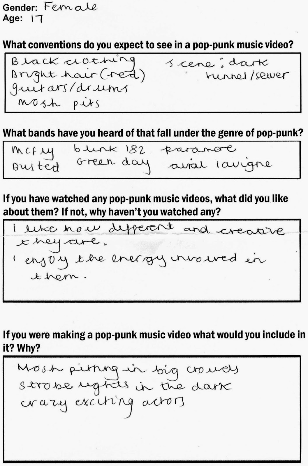
One of the things I learned from my questions is that asking a variety of people who listen to different music to pop-punk is that they will give me the stereotypical view and state the expected conventions of a pop-punk music video or artist. This made me think about Tessa Perkins' theory because I was thinking of including some of the things the people I asked came up with, which shows how stereotypes come from somewhere as whilst I was analysing pop-punk music videos many of those things appeared in them.
Here I have asked two completely different people as the male is 21 and the female is 17, however both people came up with the same ideas which I felt showed the stereotyping coming through. These also weren't part of my target audience, however they have heard of many pop-punk bands, which shows how pop-punk can still be popular and make it into the charts as many of the bands they have mentioned have done.
I purposely didn't do much audience research just because I had an idea in my head already of what I wanted my video to look like and what narrative/s I wanted to follow. I think doing the generic questionnaire to people around the 17-21 age bracket was effective in the way that it gave me many ideas to use in my music video without stretching from my original ideas, by sticking to my target audience age and by sticking to stereotypes and conventions of pop-punk which made the genre clear to the audience.
I did some charts on my pre production polls that I posted on my blogs.
The first chart is on the preferred genre. In this case, I listened to what the audience preferred as they voted pop-punk. I also wanted to do pop-punk anyway because I feel it is a good genre to stick to conventions.
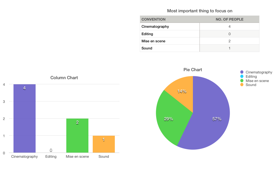
I also did a poll on what people think the most important convention is. The outcome was cinematography therefore I was motivated on concentrating on what the shots looked like and including different varieties of shots in order to make it look aesthetically pleasing.

Finally, the last poll I did was on what people thought would be the best narrative. The outcome was abstract however some people did vote for a narrative, therefore I tried to interpret both into my video and ancillary texts in order to make my product more versatile.


 After I took a look at the statistics, I realised that the potential target audience for my products are likely to be from the United States and the UK due to the fact that a lot more people have viewed my blog from there than they have other countries.
I did a target audience profile because I felt that it was important to show who I expect will listen to the album that I have tried to promote and I think it shows how I have taken into consideration the interests that my audience will have and what magazines they read.
I also think that I have created a good role model based on this profile as I think my artist shares things with 'Hannah White' therefore she will be more appealing and seem like a real person, rather than someone who could be potentially be seen as intimidating and fake like a pop artist like Rita Ora.
I also think that because things are so much more accessible because of the internet and social media, my artist will be discovered in ways like that because my artist will be able to promote things herself for free and reach an audience that chose to follow and listen to her. I did some audience research after I finished my product by creating a twitter account for my artist and promoted her music video.
Doing this meant that the audience could also interact with my artist and share their own opinions which is very helpful as it means that the next promotion package my artist does will be able to be influenced by the feedback I got back from them and make them want to listen to her more.
Blogger also provided me with the viewing statistics of my blog which I thought was extremely helpful as it gave me an idea of who is actually viewing my blog and provides me with information on who my target audience should be.
Thursday 16 April 2015
Q4 How did you use media technologies in the construction and research, planning and evaluation stages?
The first thing I did was talk about how I have used different technologies in my products and what I used them for.
 Here are the notes I used for making this video.
Here is a list of some of the main technology I used in order to complete my planing and research, production and post production.


 I used SlideShare to put my presentations together,as the website allowed me to put my powerpoint onto a slide show type thing. This allowed my blog and my presentation to look neater and more professional as it made my powerpoints flow and go in an order I wanted them to be seen . Also, it was an easy website to use, as it only took a few moments to upload a file. I also merged the use of BlogSpot and the use of SlideShare together as I was able to embed the SlideShare’s onto my blog easily. It was also extremely easy to navigate the SlideShare by selecting the arrows to move onto the next slide.

Here is a list of some of the main technology I used in order to complete my planing and research, production and post production.
Microsoft Powerpoint was helpful in terms of presentations as it made it easier to present my ideas and upload them onto things like SlideShare which enabled me to upload it to my blog. It also meant that when I did have several ideas, such as the clothing and make-up ideas, I could collectively adapt them all together within a powerpoint. I could also adapt the colours, fonts, texts, images and animations in a personal way which I felt was appropriate. Therefore, this use of technology was extremely beneficial as I was able to present my ideas in a more attractive and appealing way.
I used the internet for endless aspects of the planning and research stages. For example, I used Google images to collect appropriate images of relevant things, which I would need, such as singers, performers, digipaks and magazine adverts. This allowed me to present my ideas with photographs and images and was aesthetically pleasing when I uploaded them onto blogger.
I used SlideShare to put my presentations together,as the website allowed me to put my powerpoint onto a slide show type thing. This allowed my blog and my presentation to look neater and more professional as it made my powerpoints flow and go in an order I wanted them to be seen . Also, it was an easy website to use, as it only took a few moments to upload a file. I also merged the use of BlogSpot and the use of SlideShare together as I was able to embed the SlideShare’s onto my blog easily. It was also extremely easy to navigate the SlideShare by selecting the arrows to move onto the next slide.
Twitter was helpful with the promotion of my artists product and allowed me to get ideas and opinions from real existing artists on their own products, allowing me to transfer these characteristics to my artist.
I have already discussed the uses of the main media technology that allowed me to actually produce my products (photoshop and iMovie). I feel I have developed a lot since my foundation portfolio in using them as instead of taking more than a week to produce a still imaged product, it took me around 1 day to fully complete both my digipak and poster. On the other hand working with moving image was something new to me so the technology I had to use to help me produce my music video where things like the internet and youtube which provided tutorials on how to use it.
I have already discussed the uses of the main media technology that allowed me to actually produce my products (photoshop and iMovie). I feel I have developed a lot since my foundation portfolio in using them as instead of taking more than a week to produce a still imaged product, it took me around 1 day to fully complete both my digipak and poster. On the other hand working with moving image was something new to me so the technology I had to use to help me produce my music video where things like the internet and youtube which provided tutorials on how to use it.
Subscribe to:
Posts (Atom)